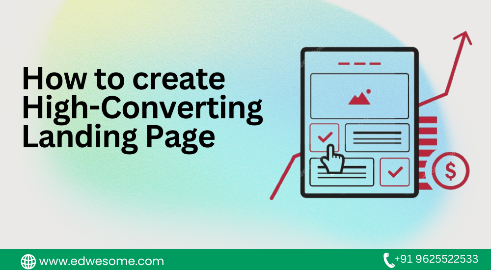
In the realm of digital marketing, the landing page stands as a pivotal tool in driving conversions and achieving business objectives. A well-crafted landing page can captivate visitors, entice them to take action, and ultimately bolster your bottom line. This comprehensive guide delves into the intricacies of creating a high-converting landing page that serves as a magnet for your target audience.
1. Understanding the Essence of a Landing Page
Defining a Landing Page
A landing page is a targeted web page designed with a specific purpose in mind: to prompt visitors to take a particular action. This action could be signing up for a newsletter, making a purchase, requesting a demo, or any other action that aligns with your business goals.
Differentiating Landing Pages from Websites
A common misconception is that landing pages are synonymous with websites. While websites contain multiple pages and serve as comprehensive sources of information, landing pages are focused and singular in purpose. They are designed to guide visitors toward a conversion without the distractions of a full website.
The Significance of Landing Pages in Boosting Conversions
Landing pages play a pivotal role in the realm of conversion optimization. They are finely tuned to encourage visitors to complete a specific action, which makes them ideal for directing traffic from advertising campaigns, email marketing, and social media. Their focused design minimizes friction and maximizes the likelihood of achieving your desired outcomes.
2. Setting Clear Objectives
Defining Your Conversion Goal
Before embarking on the creation of a landing page, it’s imperative to define your conversion goal. This could be anything from lead generation to product sales. Clarity in your goal guides every aspect of your landing page, from design to copy.
Aligning Landing Page Content with Objectives
Every element on your landing page, from the headline to the CTA, should align with your conversion goal. If your objective is to gather email subscribers, your page’s content should revolve around the benefits of subscribing and what users can expect.
Crafting Compelling Calls-to-Action (CTAs)
The call-to-action (CTA) is the pivotal element that compels visitors to take action. Design CTAs that are visually distinct, concise, and action-oriented. Use compelling verbs that create a sense of urgency, like “Get Started” or “Unlock Now.”
3. Audience-Centric Design
Grasping User Psychology and Behavior
Understanding user psychology is key to creating a landing page that resonates. Consider the emotional triggers, pain points, and desires of your target audience. Design with empathy to establish a genuine connection.
Employing Responsive and Mobile-Friendly Design
Given the prevalence of mobile browsing, responsive design is non-negotiable. Your landing page should adapt seamlessly to different screen sizes, ensuring a consistent and enjoyable experience for all users.
Creating a Visually Appealing Layout
The layout of your landing page should guide users’ attention naturally. Use visual hierarchy to prioritize key elements. Employ whitespace to prevent visual clutter and enhance readability.
4. Mastering the Art of Copywriting
Crafting Attention-Grabbing Headlines
The headline is the first thing visitors see, so it should be attention-grabbing and relevant. A compelling headline communicates the unique value proposition and entices visitors to explore further.
Formulating Persuasive and Concise Copy
Each word on your landing page should have a clear and meaningful role. Craft persuasive copy that highlights the benefits of your offer, addresses pain points, and provides a clear value proposition.
Incorporating Storytelling Techniques
Storytelling has the power to engage and emotionally connect with visitors. Share stories that resonate with your audience and illustrate how your product or service can positively impact their lives.
5. Engaging Visual Elements
Utilizing High-Quality Images and Graphics
Visual elements evoke emotions and can convey information faster than text. Use high-quality images and graphics that enhance your message and align with your brand’s aesthetics.
Introducing Persuasive Videos
Videos are excellent tools for engaging visitors quickly. Use videos to demonstrate product features, share customer testimonials, or provide a deeper understanding of your offering.
Balancing Visual Elements with Text
While visuals are crucial, an overload of images or videos can overwhelm visitors. Achieve a balanced blend of visuals and text to deliver a coherent message and guide users toward your CTA.
6. Establishing Trust and Credibility
Showcasing Testimonials and Reviews
Social proof in the form of testimonials, reviews, and case studies builds credibility. Highlight positive experiences from satisfied customers to alleviate concerns and encourage trust.
Displaying Trust Badges and Certifications
Trust badges, such as SSL certificates or industry certifications, reassure visitors that their data is secure and that your business adheres to industry standards.
Providing Transparent Contact Information
Clear and easily accessible contact information, including a phone number, email address, and physical address, enhances credibility and shows that your business is legitimate and reachable.
7. Form Optimization for Conversions
Simplifying Form Fields and Minimizing Friction
The form on your landing page should be concise and ask for only essential information. Reducing the number of form fields minimizes friction and encourages more users to complete the form.
Incorporating Smart Form Features
Use smart form features, such as dynamic form fields or autofill, to make the form-filling process effortless for users. This can improve the user experience and increase form submissions.
A/B Testing Form Variations for Effectiveness
A/B testing different form variations can reveal which form fields and designs lead to higher conversion rates. Experiment with different form lengths, field arrangements, and button colors to optimize results.
8. Crafting Compelling Headlines
The Anatomy of an Effective Headline
A compelling headline encapsulates the essence of your offer and entices visitors to read on. An effective headline is clear, concise, and communicates a benefit or solution.
Aligning Headlines with Ad Copy and Keywords
If your landing page is linked to an ad campaign, ensure consistency between your ad copy and landing page headline. This reassures visitors that they’ve landed in the right place.
Testing Headline Variations for Impact
Experiment with different headline variations to find the most effective one. A/B testing can reveal which headlines resonate best with your target audience and drive higher engagement.
9. Strategic Use of Color and Psychology
Understanding Color Psychology in Design
Colors evoke emotions and can influence decision-making. Different colors carry distinct associations, and choosing the right color palette can convey the desired mood and message.
Employing Color to Guide Attention and Action
Use color strategically to direct users’ attention to key elements, such as CTAs and important information. Contrast can help essential elements stand out and prompt action.
Creating a Harmonious and Impactful Color Palette
Choose a color scheme that reflects your brand’s identity and connects with the preferences of your intended audience. A well-chosen color scheme enhances visual appeal and reinforces brand recognition.
10. Responsive and Fast Loading
The Significance of Mobile Responsiveness
With mobile browsing on the rise, mobile responsiveness is a must. Ensure your landing page displays seamlessly across devices and offers a user-friendly experience.
Ensuring Quick Loading Times
Slow-loading pages can deter visitors and lead to high bounce rates. Optimize images, use caching mechanisms, and employ best practices to ensure swift loading times.
Reducing Bounce Rates with Optimized Performance
By offering a responsive design and fast loading times, you can reduce bounce rates and increase the likelihood of visitors engaging with your content and converting.
11. Testing and Optimization
The Importance of A/B Testing
A/B testing involves creating two or more versions of a landing page and testing them to see which version performs better. This iterative process allows you to refine elements and achieve optimal results.
Analyzing Data and Metrics
Data-driven decisions are crucial for optimization. Analyze metrics such as conversion rate, bounce rate, click-through rate, and time spent on page to gain insights into user behavior.
Iterative Improvements for Enhanced Performance
Based on the insights gained from A/B testing and data analysis, continuously iterate and refine your landing page. Minor adjustments can result in substantial enhancements to conversion rates.
12. Creating a Sense of Urgency and Scarcity
Harnessing Urgency and Scarcity in Marketing
Urgency and scarcity are psychological triggers that can prompt immediate action. Fostering a sense of urgency can motivate visitors to act promptly rather than delaying their response.
Utilizing Countdown Timers and Limited Offers
Countdown timers and limited-time offers create a sense of urgency by highlighting the limited availability of a deal. These techniques can motivate visitors to act swiftly.
Striking a Balance to Avoid Overuse
While urgency and scarcity can be powerful motivators, they should be used judiciously. Overusing these tactics can lead to skepticism and erode trust with your audience.
13. Optimizing for SEO and Paid Advertising
Incorporating Relevant Keywords
For organic search traffic, incorporate relevant keywords in your landing page content. Ensure that keywords align with user intent and the purpose of the landing page.
Tailoring Landing Pages for Ad Campaigns
If your landing page is part of an ad campaign, ensure a seamless transition from the ad to the landing page. Consistency in messaging and design enhances user experience.
Enhancing Quality Score and Ad Rank
For paid advertising, a high-quality landing page contributes to a better Quality Score and Ad Rank. This can result in better ad placements and lower costs per click.
14. Personalization for Enhanced Engagement
Utilizing Dynamic Content Based on User Data
Dynamic content personalizes the landing page experience based on user data, such as location or browsing history. This enhances relevance and engagement.
Customizing Landing Pages for Different Segments
Create landing pages tailored to different audience segments. This ensures that visitors receive content that speaks directly to their needs and preferences.
Elevating User Experience Through Personalization
Personalization enhances user experience by delivering content that resonates. It can lead to higher engagement, longer time spent on page, and increased conversions.
15. Balancing Simplicity and Information
Presenting Essential Information Concisely
While it’s important to communicate the value of your offer, avoid overwhelming visitors with excessive information. Present the most crucial details concisely.
Avoiding Clutter and Overwhelming Visuals
Cluttered layouts and an overabundance of visuals can detract from your message. Maintain a clean design with ample whitespace to guide users through the content.
Guiding Users with Clear Hierarchical Structure
Establish a clear hierarchy that guides visitors’ attention from the headline to the CTA. Use headings, subheadings, and formatting to create an organized flow.
16. Gaining Insights from Case Studies
Examining Successful Landing Page Examples
Analyze real-life examples of successful landing pages across industries. Understand the elements that contribute to their effectiveness.
Deconstructing Strategies and Elements
Break down the strategies used in these case studies. Examine headline structures, layout choices, CTAs, and other design elements that contribute to conversions.
Applying Lessons Learned to Your Own Pages
While every business is unique, the lessons from successful case studies can serve as inspiration. Apply these insights to your own landing pages, testing and adapting them as needed.
17. The Psychology of Persuasion
Tapping into Psychological Triggers
Understand psychological triggers like reciprocity, social proof, and authority. Incorporate these triggers into your landing page elements to influence user behavior.
Incorporating Social Proof and Authority
Displaying customer testimonials, case studies, and endorsements from industry experts establishes credibility and enhances trust.
Influencing Decision-Making Through Persuasion Techniques
Use persuasion techniques like scarcity, reciprocity, and emotional appeals to nudge visitors toward conversion. Balance these techniques for ethical and effective persuasion.
18. Conclusion
Crafting a landing page that drives high conversions is a blend of artistic finesse and scientific precision. By weaving together design principles, psychological triggers, persuasive copy, and user-centered elements, you can craft landing pages that resonate with your target audience and drive conversions. The journey to optimization doesn’t end with the creation of your landing page; continuous testing, iteration, and adaptation are key to maintaining high conversion rates and achieving your business objectives. Embrace the holistic approach outlined in this guide, and embark on the path to crafting landing pages that captivate, convert, and contribute to your success in the digital landscape.


